Table Of Content
- General introduction
- Environment set up
- What can we plot ?
- Designing an Object Oriented visualization tool
- Import the needed packages
- Create the class
- what if I use a lot of bam files ?
- How to calculate a coverage in a bam file given a genomic region ?
- A modified version to calculate the coverage histogram
- Visualizing coverage heatmap in amplicon regions
- Creating SNP related plots
- Create alignment related plots
- What’s next ?
- Contribution guidelines
General introduction
This is a list of functions we can use to generate different kind of plots for deep sequencing data.
If you don’t know what deep/targeted sequencing is, I tried to over-simplifying it in the figure below :
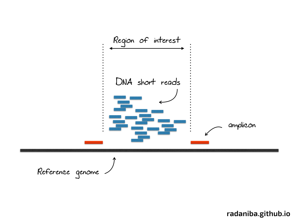
This is, at a very superficial description, an experiment aiming to amplify a specific region of the genome via sequencing in order to study a particular problem (gene expression level, SNP in cancer genome, variant calling etc ..)
On the lab, scientists design the experiment in order to make the sequencing just in the region delimited by the two red marks as shown in the figure above. A lot of short DNA reads are generated in this region (and many others like this one) that we call amplicon region.
amplicon is the region targeted by the experiment to be amplified for a given study. A more specific definition from Wikipedia : “An amplicon is a piece of DNA or RNA that is the source and/or product of natural or artificial amplification or replication events. It can be formed using various methods including polymerase chain reactions (PCR), ligase chain reactions (LCR), or natural gene duplication.”
Data comes out of the sequencer as (usually) fastq files, that we align to the reference genome using a particular aligner (the software that will map the short reads to the reference)
Once the alignment is done, two types of files can be generated, a SAM file (the alignment) and its binary version the BAM file (which we will use in this tutorial)
The way these files are generated is beyond the scope of this short tutorial, there are many things to consider and to take care of, such as quality of the fastq files used, some specific metrics that describe the success of the wet lab experiment etc .. that we will just not discuss here.
The data we will use here consists of list of bam files (one bam file per subject studied, let’s say here a tissue for example), and an interval file in a bed format (listing the amplicon regions).
Once these are generated, we need to visualize what we have to answer a number of questions such as :
- what is the coverage of the sequencing
- how are the short reads distributed across the genome ?
- is the coverage across all amplicon regions equally distributed ?
- in what specific amplicon region we see a lot of coverage in comparison to the others
- can we cluster tissues per coverage ?
- etc ..
In this short walkthrough I will show you how we can answer these questions and what we can do with python, a list of bam files as well as an amplicon region (can be any delimited regions it doesn’t have to be amplicon per se)
Let’s dive in …
Environment set up
To reproduce the examples shown here you need to set up a couple of things. I used python2.7 to generate the figures but you can try to do it in python3 and comment below to tell me if it works or not (didn’t try it personally)
Once python is installed you will need to install these packages :
Softwares
Packages
- matplotlib
- pandas
- numpy
- seaborn
- pysam
- pybedtools
I highly recommend that you use a virtual environment, if you don’t know how to do this, don’t worry and please comment below to ask how
What can we plot ?
Coverage histogram in amplicon region :
This is a distribution of coverage inside the amplicon regions. The function parses region by region and get the coverage of all the samples provided, then render a histogram with X axis being the coverage
Cumulative coverage saturation plot :
This is the same as before, instead we render a cumulative histogram, it can be useful, you can see how bad the NSG sample renders for example
Mapping qualities in amplicon regions :
This is a stacked histogram that renders the mapping qualities inside the amplicon regions, we can see that NSG is again failing and that we have a mapping qualities around 42 in this example in particular
Targeted regions coverage:
This is the so called CDF function of coverage per sample inside the target regions
Coverage heatmap inside amplicon regions:
This plot is another view of coverage inside amplicon region, it places all the samples side by side and render all the row as a heatmap, I did 2 examples here, one with a crazy sample like the NSG one and one without
Allelic frequencies heatmap
This is a plot showing the allele frequencies change across positions and samples, I tried to cluster the positions per frequencies values but I don’t get ‘clusterable’ positions, so I sorted the positions values across all samples
Zygosity Matrix
Dual clustering on positions and sample names grouping positions per zygosity (heterozygote, homozygote wildtype, homozygote mutant)
Designing an Object Oriented visualization tool
Import the needed packages
We need to import the needed libraries and to init the layout to display the plots. I usually don’t like the way matplotlib is displayed so I modify the rc_params in order to make the plots look nicer than the default.
from __future__ import division
import os
import sys
import time
import numpy as np
import pybedtools
import pandas as pd
import matplotlib as mpl
mpl.use('Agg')
import matplotlib.pyplot as plt
import matplotlib.cm as cm
from matplotlib.ticker import MaxNLocator
from matplotlib import rcParams
from matplotlib import colors
from mpltools import style
import mpld3
import matplotlib.gridspec as gridspec
import scipy.spatial.distance as distance
import scipy.cluster.hierarchy as sch
import seaborn as sns
style.use('ggplot')
my_locator = MaxNLocator(6)
rcParams['axes.labelsize'] = 9
rcParams['xtick.labelsize'] = 9
rcParams['ytick.labelsize'] = 9
rcParams['legend.fontsize'] = 7
rcParams['font.serif'] = ['Computer Modern Roman']
rcParams['text.usetex'] = False
rcParams['figure.figsize'] = 20, 10
As you can see I use the style ggplot but you can use the style you want. We don’t need to do this if we use seaborn, these changes are just for the plots using only matplotlib
Create the class
We will create a python class that will contain all the functions we will need to create our plots, along with some helper functions that will be used as methods or helpers
The overall structure will look like
class targeted(object):

    def __init__(self, list_of_bam_files, binomial_result_file_list, region_file, outdir, labels):
        self.list_of_bam_files = list_of_bam_files
        self.binomial_result_file_list = binomial_result_file_list
        self.region_file = region_file
        self.outdir = outdir
        self.labels = labels
We initialize the class with a specific number of arguments :
- A list of bam files (litterally a python list with paths to bam files)
- Labels we want to map the bam files to
- A region file (the amplicons)
- An output directory (to save the results)
- A binomial results file (this is a very specific file that is generated out of this tutorial, it is generated by a pipeline we use in the lab to detect somatic mutations using binomial test, the file contains information about the mutation type, their positions, the coverage at their specific locations etc ..) contact me if you need a copy of this pipeline
what if I use a lot of bam files ?
I usually add a helper function to warn users if they use an excessive number of bam files and want to see them all in the same plot. For that I use a small function to do that
def warning(self):
        N = len(self.list_of_bam_files)
        if N >= 10:
            print u"\u2601" + " You are generating plots for " + str(N) + " bam files, some plots will be really really ugly !"
How to calculate a coverage in a bam file given a genomic region ?
To do that we will need to use the fantastic tool bedtools and its python wrapper pybedtools. If you’re not familiar with bedtools I highly recommend that you go through their excellent documentation and read the full list of function that it comes with, may be you’ll find them useful for other projects that you have too
def get_coverage(self, bam_file):
        """
        Get coverage from a BAM file,  by looking only inside the regions provided by the region_file
        This function is wrapping the coberageBed from BedTools with no histogram creation

        What to test ?:

        if alignment is empty
        if region file is empty
        if coverage_result is empty

        """
        alignment = pybedtools.BedTool(bam_file)
        regions = pybedtools.BedTool(self.region_file)
        print 'Calculating coverage over regions ...'
        sys.stdout.flush()
        t0 = time.time()
        coverage_result = alignment.coverage(regions).sort()
        coverage_array = np.array([i[-1] for i in coverage_result], dtype=int)

        t1 = time.time()
        print 'completed in %.2fs' % (t1 - t0)
        sys.stdout.flush()
        return coverage_array
pretty simple ! the function just reads the bam file and the regions file and gets a nice table with the count per region. for the purpose of this tutorial, we only need the coverage data not the regions themselves.
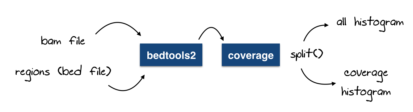
A modified version to calculate the coverage histogram
Similar to the function above, we can add a small hack to generate the coverage histogram (generated by bedtools too, there is nothing complicated we do here)
Now, may be you will think this is getting more complicated now, but it is not, let me add a small figure to explain what we’re doing here :
@staticmethod
def split_coverage(x):
    """
    Split a coverage file created using bedtools coverage -hist -- which will
    have trailing "all" hist lines -- into 1) a BedTool object with valid BED
    lines and 2) a pandas DataFrame of all coverage, parsed from the trailing
    "all" lines.
    `x` can be a filename or a BedTool instance.
    """
    if isinstance(x, basestring):
        fn = x
    else:
        fn = x.fn

    f = open(fn)
    hist_lines = []

    def gen():
        """
        Generator that yields only valid BED lines and then stops.
        The first "all" line is appended to hist_lines.
        """
        while True:
            line = f.next()
            toks = line.strip().split('\t')
            if toks[0] == 'all':
                # Don't need to include the "all" text in the first field.
                hist_lines.append(toks[1:])
                break
            yield pybedtools.create_interval_from_list(toks)

    # Create a BedTool from the generator, and call `saveas` to consume the
    # generator.  We need this so that the file pointer will stop right after
    # the first "all" line.
    b = pybedtools.BedTool(gen()).saveas()

    # Pick up where we left off in the open file, appending to hist_lines.
    while True:
        try:
            line = f.next()
        except StopIteration:
            break
        hist_lines.append(line.strip().split('\t')[1:])

    df = pd.DataFrame(
        hist_lines,
        columns=['depth', 'count', 'size', 'percent'])
    return b, df


def get_coverage_histogram(self, bam_file, outfile):
    """
    This function is important to get the `all` histogram data from BedTools coverageBed
    This will be used to plot the cumulative distribution plot of the coverage
    """
    alignment = pybedtools.BedTool(bam_file)
    regions = pybedtools.BedTool(self.region_file)
    coverage = alignment.coverage(regions, hist=True, output=outfile)
    # Now get the coverage and the all histogram
    coverage_histogram, all_histogram = self.split_coverage(coverage)

    for _ in coverage_histogram:
        pass

    return coverage_histogram, all_histogram
Visualizing coverage heatmap in amplicon regions
Now that we can generate the coverage count using bedtools, we can easily plot the coverage heatmap with the amplicon regions displayed in y axis and the bam files label list as x axis
To generate this plot I use the handy seaborn function .. heatmap :)
def plot_coverage_heatmap(self, heatmap_name):
    """
    This function calculates coverage across different bam files
    Then it plot the heatmap of coverage per amplicon region
    """
    region = pybedtools.BedTool(self.region_file)
    result = region.multi_bam_coverage(bams=self.list_of_bam_files, output=os.path.join(self.outdir, "multicoverage.hist.txt"))
    coverage_df = pd.read_table(result.fn, header=None)
    ncols = coverage_df.shape[1]
    data = coverage_df[list(coverage_df.columns[3:ncols])].astype(int)
    # Set columns
    data.columns = self.labels
    # Set index
    data_index = [str(chrom) + ":" + str(start) + "--" + str(end) for chrom, start, end in zip(list(coverage_df[coverage_df.columns[0]]), list(coverage_df[coverage_df.columns[1]]), list(coverage_df[coverage_df.columns[2]]))]
    data['coordinates'] = data_index
    data = data.set_index('coordinates')
    fig = plt.figure()
    sns.heatmap(data, square=False, annot=True, fmt="d",  annot_kws={"size": 5})
    plt.xticks(rotation=90, fontsize=5)
    plt.yticks(fontsize=5)
    plt.title("Coverage within amplicon regions")
    plt.ylabel("amplicon regions")
    plt.xlabel("samples")
    fig.tight_layout()
    fig.savefig(os.path.join(self.outdir, heatmap_name))
and this generate our first nice plot like shown below

Great ! That was our first coverage plot where you can observe that some samples have more coverage than others is some of the regions.
Creating SNP related plots
As I mentioned earlier in this post, I use a file as input, but I didn’t really explained how we get this file and how it looks like.
Our group developed a pipeline to predict somatic mutations given a set of positions as well as a set of bam files. What it does briefly is that it calculates the coverage across the entire amplicon regions at each position as a background count and it uses the coverage at a given position as foreground and via a binomial test it tries to predict whether or not a change in a variant at a given spot is considered as a somatic position significantly or not.
Each position comes with an allele_frequency which is a value between [0,1]
Our first SNP related plot will then be a clustering per allele frequencies per region and per sample !
To generate this plot we use this function :
def plot_allelic_frequencies_heatmap_with_clusters(self, allele_freq_image):
        """
        Returns a dataframe containing only alleles frequencies from
        the list of binomial test analysis
        Concat dataframes (var frequencies)
        alternatively in a loop we read a filename we split extension and we create an array
        with the values of allele frequencies having the same name as the sample
        Here is the process :
        Initialize a global dataframe called all_samples_allele_frequencies
        Columns = list of sample name (without TSV)
        1- Read the file list
        2- split the filename and the extension
        3- replace every (-) in the filename by (_) because it cannot be included in variable name
        4- Read the tsv file to a pandas dataframe df_tmp
        5- Cut the column of var_freq into a variable with the same filename (example df.tmp -> SA495_Normal)
        6- Append the result array to the golbal dataframe that will contain all allele frequencies of all the samples
        7- plot the dataframe into a heatmap using matplotlib
        """
        labels = []
        all_samples_allele_frequencies = pd.DataFrame()
        for sample_file in self.binomial_result_file_list:
                # Create the sample name out of the file path
            sample_name = os.path.basename(sample_file).split('.tsv')[0].replace('-', '_')
            labels.append(sample_name)
            # Load the variant_status table into a temporary dataframe
            df_tmp = pd.read_csv(sample_file, sep='\t')
            # Extract the var_freq column
            var_freq = df_tmp['var_freq'].values
            # Add it to the general dataframe that will be plotted
            all_samples_allele_frequencies[sample_name] = var_freq.astype(float)
        tmp = pd.read_csv(self.binomial_result_file_list[0], sep='\t')
        index_col = [str(a) + "--" + str(b) for a, b in zip(tmp.chrom, tmp.coord)]
        all_samples_allele_frequencies.index = index_col
        # drop nan values
        all_samples_allele_frequencies = all_samples_allele_frequencies.fillna(80)
        # set the threshold for NaN
        threshold = 1.1
        cmap = cm.Purples
        cmap.set_over('slategray')
        all_samples_allele_frequencies.reset_index(drop=True)
        # calculate pairwise distances for rows
        pairwise_dists = distance.squareform(distance.pdist(all_samples_allele_frequencies))
        # create clusters
        clusters = sch.linkage(pairwise_dists, method='complete')
        # make dendrograms black rather than letting scipy color them
        sch.set_link_color_palette(['black'])
        # dendrogram without plot
        # den = sch.dendrogram(clusters, color_threshold = np.inf, no_plot = True)
        row_clusters = clusters
        # calculate pairwise distances for columns
        col_pairwise_dists = distance.squareform(distance.pdist(all_samples_allele_frequencies.T))
        # cluster
        col_clusters = sch.linkage(col_pairwise_dists, method='complete')
        # heatmap with row names
        fig = plt.figure(figsize=(15, 20), dpi=10)
        heatmapGS = gridspec.GridSpec(2, 2, wspace=0.0, hspace=0.0, width_ratios=[0.25, 1], height_ratios=[0.25, 1])
        ### col dendrogram ###
        col_denAX = fig.add_subplot(heatmapGS[0, 1])
        col_denD = sch.dendrogram(col_clusters, color_threshold=np.inf)
        self.clean_axis(col_denAX)
        ### row dendrogram ###
        row_denAX = fig.add_subplot(heatmapGS[1, 0])
        row_denD = sch.dendrogram(row_clusters, color_threshold=np.inf, orientation='right')
        self.clean_axis(row_denAX)
        ### heatmap ####
        heatmapAX = fig.add_subplot(heatmapGS[1, 1])
        axi = heatmapAX.imshow(all_samples_allele_frequencies.ix[row_denD['leaves'], col_denD['leaves']], interpolation='nearest', aspect='auto', origin='lower', cmap=cm.Purples, vmax=threshold)
        heatmapAX.grid(False)
        self.clean_axis(heatmapAX)
        ## row labels ##
        heatmapAX.set_yticks(np.arange(all_samples_allele_frequencies.shape[0]))
        heatmapAX.yaxis.set_ticks_position('right')
        heatmapAX.set_yticklabels(all_samples_allele_frequencies.index[row_denD['leaves']], fontsize=5)
        ## col labels ##
        heatmapAX.set_xticks(np.arange(all_samples_allele_frequencies.shape[1]))
        xlabelsL = heatmapAX.set_xticklabels(all_samples_allele_frequencies.columns[col_denD['leaves']])
        # rotate labels 90 degrees
        for label in xlabelsL:
            label.set_rotation(90)
        # remove the tick lines
        for l in heatmapAX.get_xticklines() + heatmapAX.get_yticklines():
            l.set_markersize(0)
        ### scale colorbar ###
        scale_cbGSSS = gridspec.GridSpecFromSubplotSpec(1, 2, subplot_spec=heatmapGS[0, 0], wspace=0.0, hspace=0.0)
        # colorbar for scale in upper left corner
        scale_cbAX = fig.add_subplot(scale_cbGSSS[0, 1])
        # note that we could pass the norm explicitly with norm=my_norm
        cb = fig.colorbar(axi, scale_cbAX)
        cb.set_label('Allele Frequencies')
        # move ticks to left side of colorbar to avoid problems with tight_layout
        cb.ax.yaxis.set_ticks_position('left')
        # move label to left side of colorbar to avoid problems with tight_layout
        cb.ax.yaxis.set_label_position('left')
        cb.outline.set_linewidth(0)
        # make colorbar labels smaller
        tickL = cb.ax.yaxis.get_ticklabels()
        for t in tickL:
            t.set_fontsize(t.get_fontsize() - 3)
        fig.tight_layout()
        fig.savefig(os.path.join(self.outdir, allele_freq_image))
        # mpld3.save_html(fig, os.path.join(args.outdir, "allele_frequencies_with_cluster.html"))
        print u"\U0001F37B" + "     Allelic Frequencies Heatmap with clusters... Done"
This will generate this plot

I will dedicate a special post on this clustering plot, there are a lot of details in it as you can see, and it deserves in my opinion a small dedicated post to it.
The pipeline I mentioned earlier generates a column in the output that describes a mutation as being heterozygote, homozygote_mutant or homozygote_wildetype. Similar to the clustering for the allele_frequencies we can design a function that clusters the positions per sample based on the zygosity
def plot_zygosity_matrix(self, allele_freq_image, cluster=0, custom_order=[]):
       """
       Returns a dataframe containing only alleles frequencies from
       the list of binomial test analysis
       Concat dataframes (var frequencies)
       alternatively in a loop we read a filename we split extension and we create an array
       with the values of allele frequencies having the same name as the sample
       Here is the process :
       Initialize a global dataframe called all_samples_zygosity
       Columns = list of sample name (without TSV)
       1- Read the file list
       2- split the filename and the extension
       3- replace every (-) in the filename by (_) because it cannot be included in variable name
       4- Read the tsv file to a pandas dataframe df_tmp
       5- Cut the column of var_freq into a variable with the same filename (example df.tmp -> SA495_Normal)
       6- Append the result array to the golbal dataframe that will contain all allele frequencies of all the samples
       7- plot the dataframe into a heatmap using matplotlib
       """
       labels = []
       all_samples_zygosity = pd.DataFrame()
       for sample_file in self.binomial_result_file_list:
           # Create the sample name out of the file path
           sample_name = os.path.basename(sample_file).split('.tsv')[0].replace('-', '_')
           labels.append(sample_name)
           # Load the variant_status table into a temporary dataframe
           df_tmp = pd.read_csv(sample_file, sep='\t')
           # convert zygosity into states
           remap_zygosity = {'homozygote_wildtype': -1, 'heterozygote': 0, 'homozygote_mutant': 1, 'unknown': 80}
           df_tmp = df_tmp.replace({'zygosity': remap_zygosity})
           # Extract the zygosity column
           zigosity = df_tmp['zygosity'].values
           # Add it to the general dataframe that will be plotted
           all_samples_zygosity[sample_name] = zigosity.astype(float)

       # If we want to plot the dataframe in a custom order we need to provide that order as a list as argument
       if len(custom_order) > 1:
           all_samples_zygosity = all_samples_zygosity[custom_order]

       tmp = pd.read_csv(self.binomial_result_file_list[0], sep='\t')
       index_col = [str(a) + "." + str(b) for a, b in zip(tmp.chrom, tmp.coord)]
       index_col = [coord.replace('X', '23') for coord in index_col]
       index_col = [coord.replace('Y', '24') for coord in index_col]
       all_samples_zygosity.index = map(float, index_col)
       # drop nan values
       all_samples_zygosity = all_samples_zygosity.sort()
       all_samples_zygosity = all_samples_zygosity.fillna(80)
       # set the threshold for NaN
       threshold = 1.1
       cmap = colors.ListedColormap(['#CC3333', '#FFCC33', '#0066CC'], 'indexed')
       cmap.set_over('slategray')
       all_samples_zygosity.reset_index(drop=True)
       if cluster == 0:
           # calculate pairwise distances for rows
           pairwise_dists = distance.squareform(distance.pdist(all_samples_zygosity))
           # create clusters
           clusters = sch.linkage(pairwise_dists, method='complete')
           # make dendrograms black rather than letting scipy color them
           sch.set_link_color_palette(['black'])
           # dendrogram without plot
           # den = sch.dendrogram(clusters, color_threshold = np.inf, no_plot = True)
           row_clusters = clusters
           # calculate pairwise distances for columns
           col_pairwise_dists = distance.squareform(distance.pdist(all_samples_zygosity.T))
           # cluster
           col_clusters = sch.linkage(col_pairwise_dists, method='complete')
           # heatmap with row names
           fig = plt.figure(figsize=(15, 20), dpi=10)
           heatmapGS = gridspec.GridSpec(2, 2, wspace=0.0, hspace=0.0, width_ratios=[0.25, 1], height_ratios=[0.25, 1])
           ### col dendrogram ###
           col_denAX = fig.add_subplot(heatmapGS[0, 1])
           col_denD = sch.dendrogram(col_clusters, color_threshold=np.inf)
           self.clean_axis(col_denAX)
           ### row dendrogram ###
           row_denAX = fig.add_subplot(heatmapGS[1, 0])
           row_denD = sch.dendrogram(row_clusters, color_threshold=np.inf, orientation='right')
           self.clean_axis(row_denAX)
           # all_samples_zygosity.index = [ 'position ' + str(x) for x in all_samples_zygosity.index ]
           # all_samples_zygosity.columns = all_samples_zygosity.columns[col_denD['leaves']]
           ### heatmap ####
           heatmapAX = fig.add_subplot(heatmapGS[1, 1])
           axi = heatmapAX.imshow(all_samples_zygosity.ix[row_denD['leaves'], col_denD['leaves']],interpolation='nearest', aspect='auto', origin='lower', cmap=cmap, vmax=threshold)
           heatmapAX.grid(False)
           self.clean_axis(heatmapAX)
           ## row labels ##
           heatmapAX.set_yticks(np.arange(all_samples_zygosity.shape[0]))
           heatmapAX.yaxis.set_ticks_position('right')
           heatmapAX.set_yticklabels(all_samples_zygosity.index[row_denD['leaves']], fontsize=5)
           ## col labels ##
           heatmapAX.set_xticks(np.arange(all_samples_zygosity.shape[1]))
           xlabelsL = heatmapAX.set_xticklabels(all_samples_zygosity.columns[col_denD['leaves']])
           # rotate labels 90 degrees
           for label in xlabelsL:
               label.set_rotation(90)
           # remove the tick lines
           for l in heatmapAX.get_xticklines() + heatmapAX.get_yticklines():
               l.set_markersize(0)
           ### scale colorbar ###
           scale_cbGSSS = gridspec.GridSpecFromSubplotSpec(1, 2, subplot_spec=heatmapGS[0, 0], wspace=0.0, hspace=0.0)
           # colorbar for scale in upper left corner
           scale_cbAX = fig.add_subplot(scale_cbGSSS[0, 1])
           # note that we could pass the norm explicitly with norm=my_norm
           cb = fig.colorbar(axi, scale_cbAX)
           cb.set_label('Zygosity')
           # move ticks to left side of colorbar to avoid problems with tight_layout
           cb.ax.yaxis.set_ticks_position('left')
           # move label to left side of colorbar to avoid problems with tight_layout
           cb.ax.yaxis.set_label_position('left')
           cb.outline.set_linewidth(0)
           # make colorbar labels smaller
           tickL = cb.ax.yaxis.set_ticklabels(['', 'homozygote_wildtype', '', '', 'heterozygote', '', '', 'homozygote_mutant'])
           for t in tickL:
               t.set_fontsize(t.get_fontsize() - 3)
           fig.tight_layout()
           fig.savefig(os.path.join(self.outdir, allele_freq_image))
       else:
           fig = plt.figure(figsize=(10, 10), dpi=10)
           # heatmapGS = gridspec.GridSpec(2, 2, wspace=0.0, hspace=0.0, width_ratios=[0.25, 1], height_ratios=[0.25, 1])
           heatmapAX = fig.add_subplot(1, 1, 1)
           axi = heatmapAX.imshow(all_samples_zygosity, interpolation='nearest',
                                  aspect='auto', origin='lower', cmap=cmap, vmax=threshold)
           heatmapAX.grid(False)
           self.clean_axis(heatmapAX)
           ## row labels ##
           heatmapAX.set_yticks(np.arange(all_samples_zygosity.shape[0]))
           heatmapAX.yaxis.set_ticks_position('right')
           heatmapAX.set_yticklabels(all_samples_zygosity.index, fontsize=5)
           ## col labels ##
           heatmapAX.set_xticks(np.arange(all_samples_zygosity.shape[1]))
           xlabelsL = heatmapAX.set_xticklabels(all_samples_zygosity.columns)
           # rotate labels 90 degrees
           for label in xlabelsL:
               label.set_rotation(90)
               label.set_fontsize(6)
           # remove the tick lines
           for l in heatmapAX.get_xticklines() + heatmapAX.get_yticklines():
               l.set_markersize(0)
           fig.tight_layout()
           fig.savefig(os.path.join(self.outdir, allele_freq_image))
       print u"\U0001F37B" + "     Zygosity matrix... Done"
and this will generate this nice cluster

Create alignment related plots
Because we use different bam files, it can be useful is to examine the mapping qualities inside the regions we’re working with. This information is already coded in the bam file and we need just to extract it and display it. One way we can do that, is with a stacked bar plot with the number of reads in the y axis and the mapping qualities in the x axis
def plot_mapping_qualities_in_regions(self, mapq_plot_image):
     """
     Return a plot with :
     Y axis = count of reads in amplicon regions
     X axis = mapping qualities within these amplicon regions
     This is done by intersection a bed version of a BAM file, with the region of interest (amplicon)
     This will return a bed file with the 5th column being the mapq vector for that bam file
     This function will reproduce this protocol for all BAM files in the list and plot them all on the same graph
     """
     N = len(self.list_of_bam_files)
     sample_colors = cm.get_cmap('RdYlBu', N)
     palette = sample_colors(np.arange(N))
     regions = pybedtools.BedTool(self.region_file)
     # samples = []
     list_of_mapq = []
     self.status_update("Plotting mapping qualities")
     fig = plt.figure()
     mapqplot = fig.add_subplot(1, 1, 1)
     mapqplot.set_title('Mapping Qualities inside regions')
     mapqplot.set_ylabel('Number of reads')
     mapqplot.set_xlabel('Mapping Quality')

     for bam_file in self.list_of_bam_files:
         alignment = pybedtools.BedTool(bam_file)
         mapq = []
         result = alignment.bam_to_bed().intersect(regions)
         for read in result:
             mapq.append(int(read[4]))
         list_of_mapq.append(mapq)
     try:
         mapqplot.hist(list_of_mapq, color=palette, stacked=True)
     except ValueError:
         pass

     mapqplot.legend(self.labels, loc='best')
     fig.tight_layout()
     fig.savefig(os.path.join(self.outdir, mapq_plot_image))
     mpld3.save_html(fig, os.path.join(self.outdir, "mapping_qualities.html"))
     print u"\U0001F37B" + "     Mapping Qualities Stacked Histogram ... Done"
which will create this stacked plot

What’s next ?
You now have the foundation of how to create plots using python, matplotlib and seaborn to display information coded in alignment files within regions provided as a bed file
Now all you have to do is to call your class and specify your arguments
import argparse
import os
from targeted_sequencing_analytics_suite import tsa


parser = argparse.ArgumentParser(description='Process different bam files and output plots on coverage and enrichment')

parser.add_argument('--path_to_bams',
                    help='''Path to bam files, sorted and indexed.''')
parser.add_argument('--targets',
                    help='''File containing amplicon regions in Bed format''')
parser.add_argument('--variant_status_path',
                    help='''Path to binomial test result files (tsv files)''')
parser.add_argument('--bam_extension',
                    help='''Extension of the alignments''')
parser.add_argument('--outdir',
                    help='''directory to save all different plots''')
parser.add_argument('--custom_order', required=False,
                    help='''order of the samples we want to display''' )

args = parser.parse_args()
On thing I use here is to read the input directory as path to bam files, the reason is that I want to split the file paths and the labels in two distinct lists
def ListFiles(sPath, extension):
    # returns a list of names (with extension, with full path) of all files
    # in folder sPath
    lsFiles = []
    lsLabels = []
    for sName in os.listdir(sPath):
        if os.path.isfile(os.path.join(sPath, sName)) and sName.endswith(extension):
            lsFiles.append(os.path.join(sPath, sName))
            fileName, fileExtension = os.path.splitext(sName)
            sName = os.path.basename(fileName).split('.')[0]
            lsLabels.append(sName)
    return lsFiles, lsLabels
Now you can call you main and feed your class
def main():

    list_of_bam_files, labels = ListFiles(args.path_to_bams, args.bam_extension)
    list_of_variant_status, status_labels = ListFiles(args.variant_status_path, ".tsv")

    result = targeted(list_of_bam_files=list_of_bam_files,
                 binomial_result_file_list=list_of_variant_status,
                 region_file=args.targets,
                 outdir=args.outdir,
                 labels=labels)

    result.warning()
    result.plot_coverage_heatmap("coverage_heatmap_in_amplicons.pdf")
    result.plot_allelic_frequencies_heatmap_with_clusters("allelic_frequencies_heatmap_clustered.pdf")
    result.plot_zygosity_matrix("zygosity_matrix_clustered.pdf", cluster=1, custom_order=read_custom_order(args.custom_order))
    result.plot_zygosity_matrix("zygosity_matrix_clustered.pdf", cluster=0)
    result.plot_mapping_qualities_in_regions("mappinq_qualities_in_region.pdf")


if __name__ == '__main__':
    main()
Voila ! That all for this tutorial
Post comments below if you have any questions and share if you like :)